Various visualization techniques, such as: Line charts and graphs Heat maps allow you to quickly analyze a data set. For example, you can use heat maps to understand student performance. This is because by viewing a heat map, you can identify students who are failing and those who scored above average. In this article, we'll learn how to create a heat map in Google Sheets.
Well, this is just one use case for using heat maps to visualize data. Google Sheets also lets you create a heat map. But did you know that you can create two types of heat maps in Google Sheets? Yes! Most notably, you can create either a color gradient heat map or a monochromatic heat map.
This guide will walk you through the basic steps for creating a heat map in Google Sheets. This includes both color ramp and single-color heat maps. However, let's take a look at the guide.
What is a heat map in Google Sheets?
Let's not get into the technicalities. In simple terms, a heat map is a technique that uses different colors or a single color to provide a visual indication of how the data in a given data set varies. Therefore, you can leverage heat maps to simplify and understand complex data.

Furthermore, it extends in two dimensions. First, regarding the question of who can use it, it can be used in almost every profession you can think of.
A teacher can use a heat map to show the number of students who scored 90 or higher. A sales manager can identify the top-performing salesperson by creating a sales heat map.
Now that you have an idea of what a heat map is, let's move on to the steps to create a heat map in Google Sheets.
Steps to create a color gradient heat map in Google Sheets
For both operations, we will use Conditional Formatting To create a heat map. Here are the steps to create a color-graded heat map in Google Sheets.
Step 1: In a Google Sheet, select the cells where you want to create a color gradient heat map.
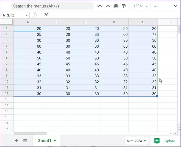
Step 2: From the top menu bar, click the “Format” button.

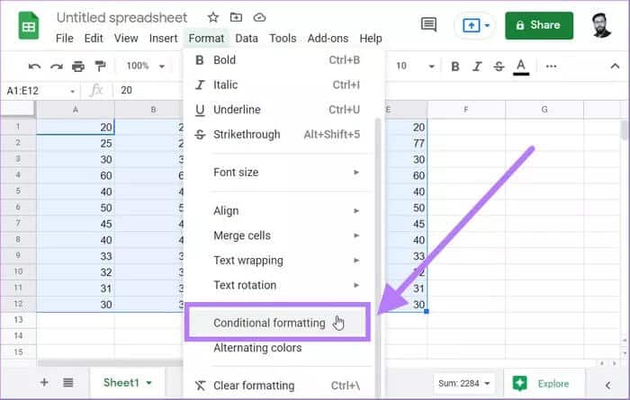
Step 3: This will open a drop-down list of options, from which you need to select Conditional Formatting.
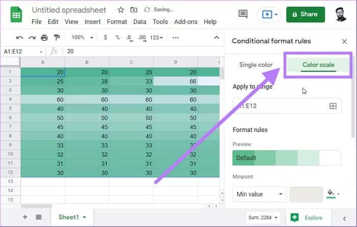
Step 4: A new sidebar titled Conditional Formatting Rules will open on the right side. Here, you need to select the Color Scale option.
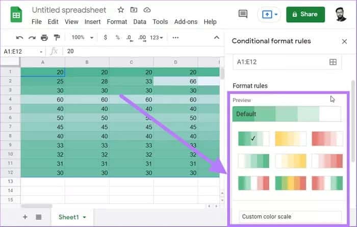
Step 5: There's a Preview button with all the default gradient map templates to choose from. Note that the color ordering is such that the color on the left is applied to the low value, while the color on the right is applied to the high value.
There's another option called "Customize Color Scale." Using this, you can give your own color scheme for this color gradient heat map.
Step 6: You can also enter the minimum, average, and maximum values, which will generate a color gradient heat map accordingly.
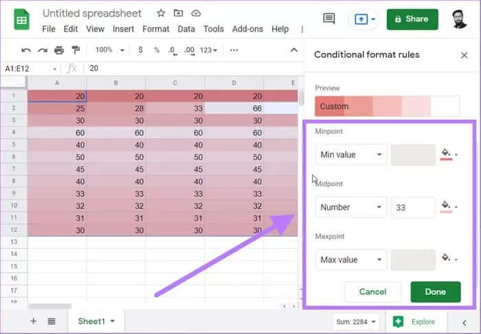
Step 7: After selecting a color scheme, click the Done button. This will create a color-gradient heat map for the selected data set.
The gradient heatmap method above applies colors based on the values in the cell. Let's understand this with an example. Suppose you have the values 70 and 90 and set white for the minimum value and red for the maximum value. Both values will be highlighted in red.
However, since 70 is smaller than 90, the dark red color will be applied to 70, creating a gradient effect. Now, let's check out how to create a single-color heat map in Google Sheets.
Steps to draw a single-color heat map in Google Sheets
Single-color heat maps are dynamic. This means that every time you change the value in the cells, the color will automatically change to reflect the format. The section below will show you how to create a single-color heat map.
Step 1: Select the values for which you want to create a single-color heat map in Google Sheets.

Step 2: Go to the Format tab and select the Conditional Formatting option.

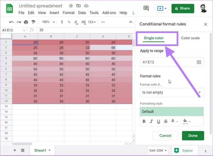
Step 3: In the Conditional Formatting pane, select the Single Color option.
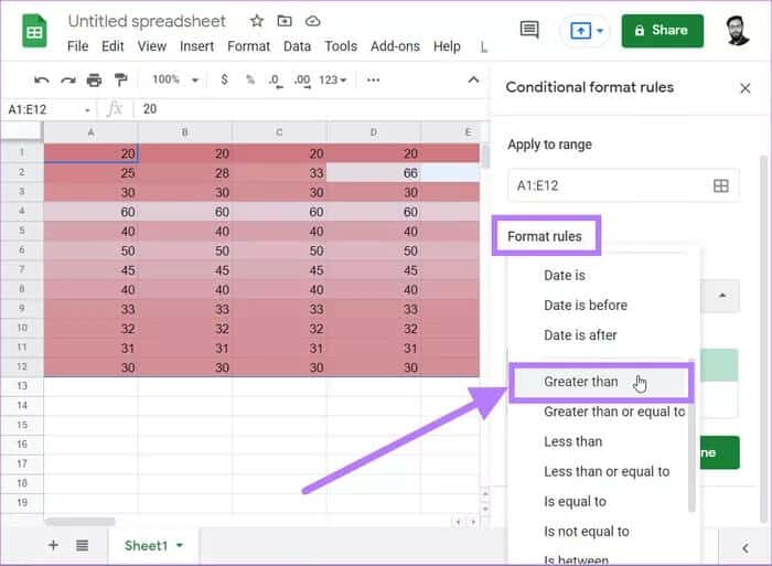
Step 4: Now, under the Formatting Rules heading, click the Format Cells If option. From the drop-down menu, select the Greater than option.
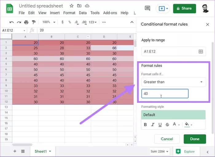
Step 5: In the Greater than field, enter the appropriate value based on your selected data set. In our case, we'll enter 40.
Step 6: Directly below the formatting rules, you'll find the Format Style option. Here, you can select the color you want to highlight cells above 40.
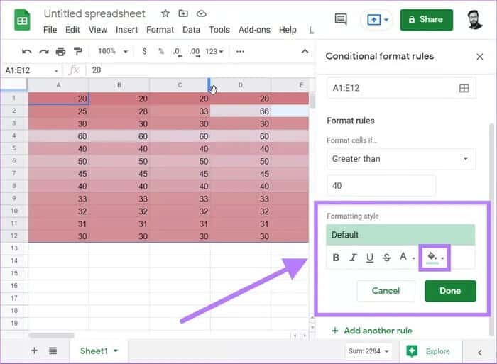
Step 7: Once you're done, simply click the Done button. You'll notice that Sheets will highlight all cells above 40 in the selected color.
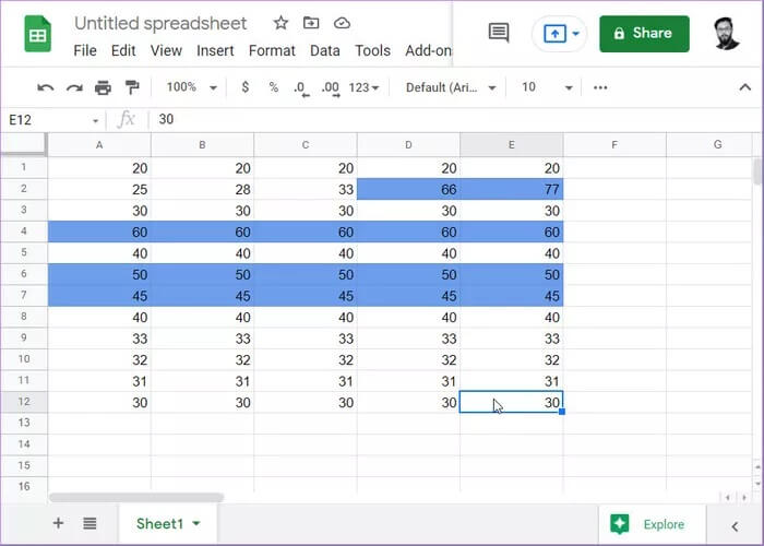
And that's it! You've created a single-color heat map in Google Sheets. Additionally, you can follow the same steps to highlight other values, say those below 40. However, this time, select a different color for quicker analysis.
Use a heat map to quickly analyze data.
A color gradient heatmap is useful when you don't have fixed criteria. For example, if you want to know which students scored below 40, all cells below 40 will be given different shades of the chosen color. Hence, the color gradient is created. However, if you have fixed criteria, where you only want to know which students scored below 40, all cells containing these values will be colored a single color.


